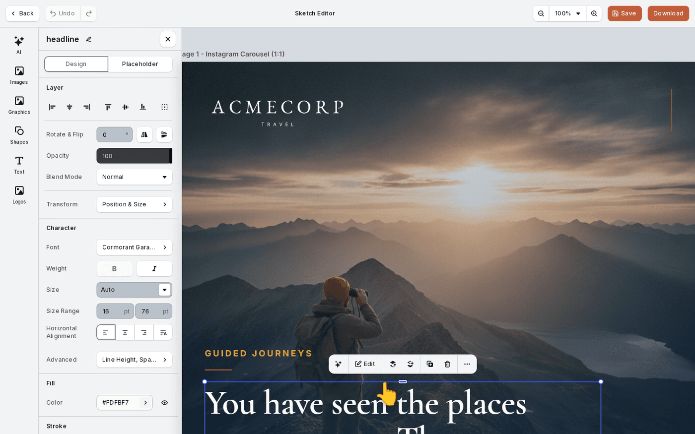
In short: Select text → the panel opens with Character, Fill, Stroke and Background. Spacing sits under Advanced.
Select any text and its controls open in the panel beside the canvas. They are grouped as Character, Fill, Stroke and Background, with spacing under Advanced.
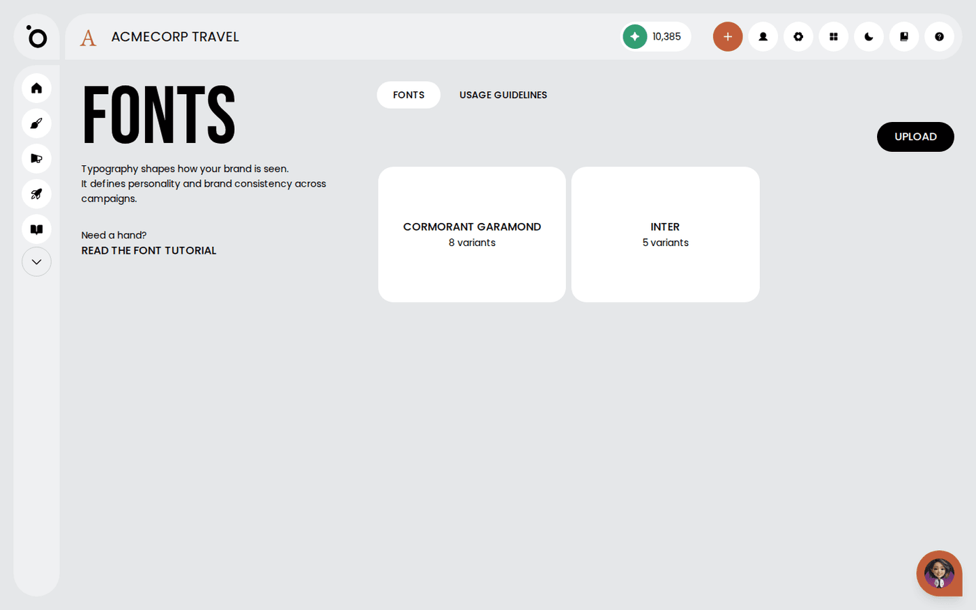
Your brand fonts are already loaded from Brand DNA, so this page is about using them well.
Set the typeface, size and weight
Under Character, your brand fonts appear first in the typeface list. Set the size. Bold and Italic are toggles. The weights on offer are the ones uploaded with the font.
Align the text
Alignment offers Left, Center, Right and Match Language Direction. There is no justify option.
Choose how the frame behaves
Frame Behavior has three options. Auto Size grows the box to fit the text. Auto Height keeps the width and grows the height. Fixed frame keeps the box as it is. Auto-Size shrinks the type to fit a fixed frame instead of overflowing.
Make copy legible over a photo
Under Background, give the text its own background with Padding and a Corner Radius. Under Stroke, add an outline. Add a Drop Shadow from Shadow. Together they keep copy readable over a busy image.
Put text on a path
Open Path and choose Arch, Circle or Wave. The text follows the curve. Choose None to take it off the path again.
Find underline and lists in the video editor only
Underline, Strikethrough and bulleted or numbered lists are in the video editor's text menu. The design editors do not have them, so do not go looking there.
Use the fonts as they are set in Brand DNA. If a weight is missing, upload it there rather than fake it with Bold.
Last updated 10 September 2026