
What you'll learn
A glossary of component names for your Design Kits
Series
3.7
Section
Brand DNAGlossary
Last Updated
Jun 3, 2026 7:51 PM
Status
Live
TL;DR: Open your Design Kit to rename template layers manually using the Component Index, ensuring each text, image, or shape block uses a recognised name to enable dynamic AI functionality.
Index of Component Names
Note: These are not case-sensitive. At some point, these will all be a drop-down selector, but it’s manual for now.
Name | Description of the dynamic component | Type |
H1 | Your main headline. This is the big, bold line that grabs attention. | Text |
H2 | A sub-headline that supports the H1 and adds context. | Text |
Short Copy | One or two short sentences for quick impact. | Text |
Medium Copy | A paragraph or two of copy—enough to explain without overwhelming. | Text |
Long Copy | Extended body text for detail-heavy layouts. | Text |
CTA | The call-to-action text itself—what you want the user to do. | Text |
Offer | Promotional line that highlights a discount, bonus, or incentive. | Text |
Speaker | Speaker name(s) for events. Number them if there are multiple (speaker1, speaker2, etc.). | Text |
Date | The event or promotional date. | Text |
image | The hero image in a banner or layout. | Image |
cta-btn | The visual button that holds your CTA. Can be a colour fill or image. | Image / Fill |
logo | Your primary brand logo. | Image |
bg | The background layer for a banner (colour fill, gradient, or image). | Image / Gradient / Fill |
page | This is the default background fill | Fill |
graphic | Decorative graphics in your design. If you use more than one, number them (graphic1, graphic2, etc.). | Image |
icon | Iconography. Number them if multiple (icon1, icon2, etc.). | Image |
photo | Supporting images or photography that aren’t hero shots. Number them if you have more than one. | Image |
shape | Shapes that aren’t graphics, icons, or buttons—like colour blocks or starbursts. Number as shape1, shape2, etc. | Shape |
How to edit component block names
Step by Step

1. Open Design Kits to access your uploaded templates.

2. Expand the template group.

3. Click the Edit icon to begin customising the selected design template.

4. Select a component to rename.

5. Rename the component here by selecting the text field. Consult the Component Index for recognised names before proceeding.
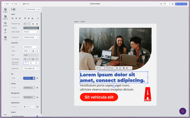
6. After entering the name, press Return or Enter to save your changes.

7. Apply the same method to each additional component in your template.
