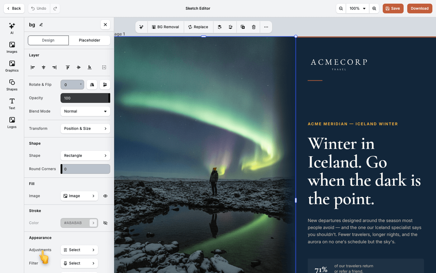
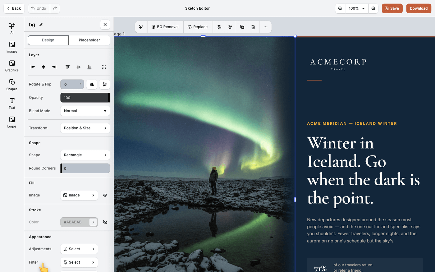
In short: Select an image → Filter. Pick a preset, then lower Intensity.
A filter changes the mood of a photo: warmer, cooler, faded, vivid. A duotone paints it in two colours, which makes photos from different shoots look like one set.
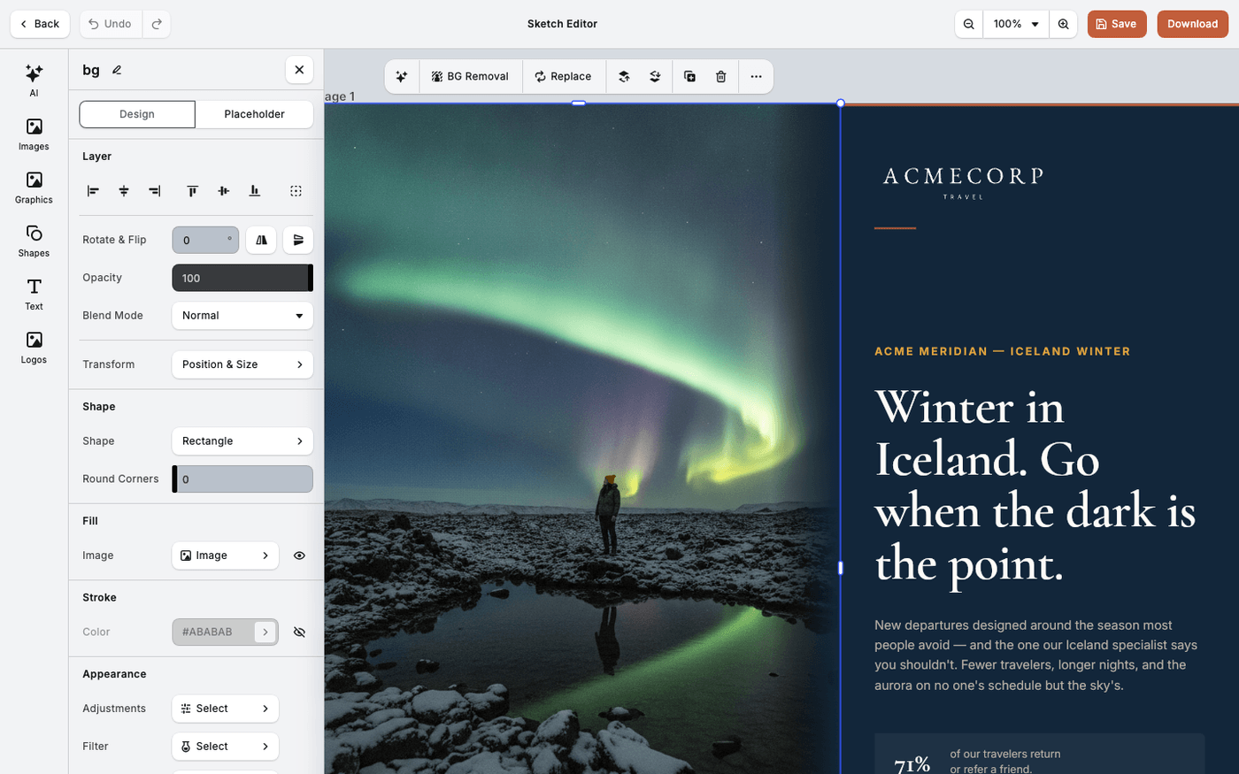
Fix the image first with Adjustments, then add the filter. Filters style an image. They do not correct it.
Open Filter
Select the image. Press Filter in the panel that opens. The presets show as thumbnails.
Choose a colour filter
The first group is colour filters. There are dozens, from soft and faded to strong and vivid. Scroll through them and click one to apply it.
Or choose a duotone
Duotone maps the image to two colours, one for the light areas and one for the dark. There are eight presets, such as Sunset, Deep Blue and Peach.
Lower the intensity
Every filter has an Intensity slider. Full strength looks like a costume. Half strength usually looks like a style.
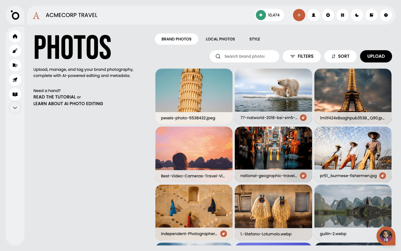
Try a duotone in your brand colours. It makes photos that were never shot together look like one campaign.
Last updated 14 August 2026