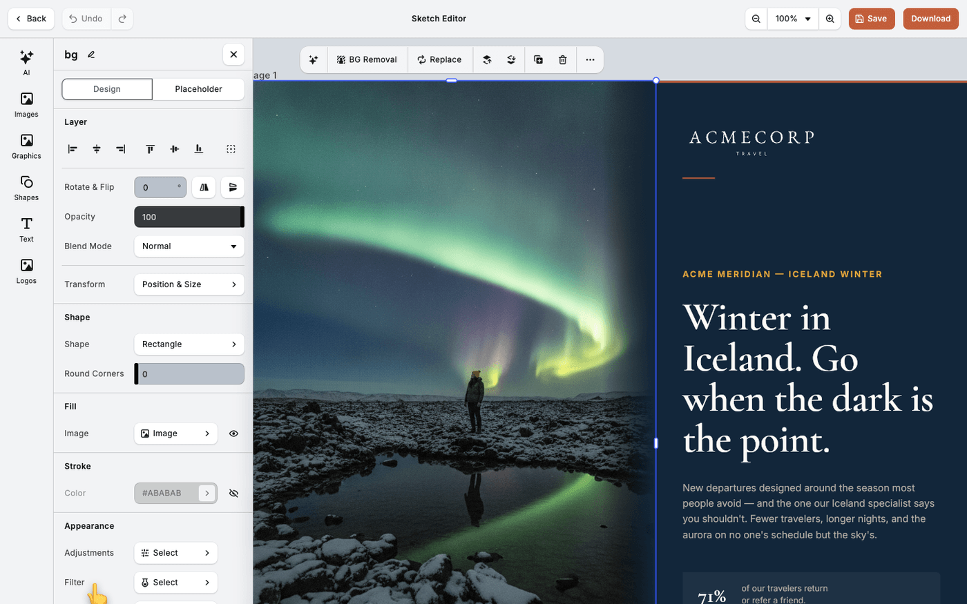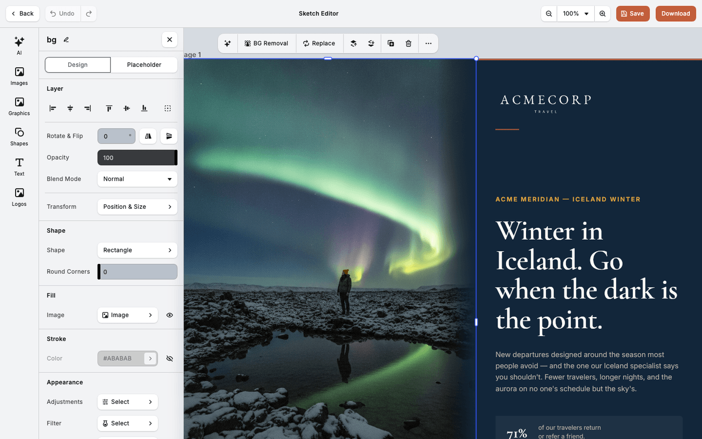
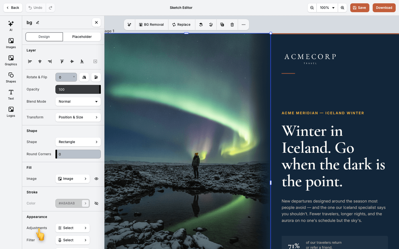
In short: Select an image → Adjustments. Move the sliders, starting with Exposure.
A photo that is a little dark or a little flat spoils a layout. Adjustments fixes that in the editor, so you do not need another program. It takes about three minutes.
Select the image and press Adjustments in the panel that opens. There are twelve sliders in two groups: Basic and Refinements. Drag a slider and the image changes as you drag.
Fix the overall brightness
Start with Exposure. It makes the whole image lighter or darker. Brightness does the same, more gently. Contrast makes the light parts lighter and the dark parts darker.
Rescue the bright and dark areas
Highlights brings back detail in a bright sky. Shadows lifts a dark subject. Whites and Blacks set the brightest and darkest points of the image.
Fix the colour
Temperature moves the image from warm to cool. Use it when a photo looks too orange or too blue. Saturation makes colours stronger or weaker. Small moves are enough.
Add bite
Clarity adds contrast to the details. Sharpness makes edges crisper. Both look better at half strength than at full.
Lift a flat image
Gamma changes the midtones only. The brightest and darkest parts stay where they are. Try it when an image looks flat and the other sliders make it worse.
There is no hue, vibrance, curves or levels control. If an image needs those, fix it before you upload it to Protaigé.
Last updated 14 August 2026